A post on the Bradley Terry model with NFL game data. The Bradley Terry model:
\[\log{\frac{p_{ij}}{1 - p_{ij}}} = \beta_i - \beta_j\]
Is a classical model for ranking or preference data and is sometimes referred to as a preference model.
1
2
3
4
5
6
7
8
9
10
| import pandas as pd
import plotly.graph_objects as go
import plotly.express as px
from IPython.display import display, Markdown
import statsmodels.api as sm
from statsmodels.stats.outliers_influence import variance_inflation_factor
import patsy
import numpy as np
from sklearn.metrics import confusion_matrix
from sklearn.metrics import roc_curve, roc_auc_score
|
1
2
3
4
5
6
7
8
9
10
11
12
13
| def render_plotly_html(fig: go.Figure) -> None:
fig.show()
display(
Markdown(
fig.to_html(
include_plotlyjs="cdn",
)
)
)
def render_table(df: pd.DataFrame | pd.Series) -> Markdown:
return Markdown(df.to_markdown())
|
NFL Game Data.
This data was collected through ESPN’s public API. Our goal will be to model the probability of a home team beating an away team,
\[p_{ij} = \text{Probability that home team $i$ beats away team $j$}\]
We will use the Bradley Terry model using the NFL game data.
1
2
3
4
| df = pd.concat([pd.read_csv("games_2023.csv"), pd.read_csv("games_2024.csv")])
print(df.shape)
ALL_TEAMS = list(sorted(set(df.awayTeamAbbr)))
render_table(df.describe())
|
| | season_type | week | event | firstDowns_away | firstDownsPassing_away | firstDownsRushing_away | firstDownsPenalty_away | totalOffensivePlays_away | totalYards_away | yardsPerPlay_away | totalDrives_away | netPassingYards_away | yardsPerPass_away | interceptions_away | rushingYards_away | rushingAttempts_away | yardsPerRushAttempt_away | turnovers_away | fumblesLost_away | interceptions_away.1 | defensiveTouchdowns_away | firstDowns_home | firstDownsPassing_home | firstDownsRushing_home | firstDownsPenalty_home | totalOffensivePlays_home | totalYards_home | yardsPerPlay_home | totalDrives_home | netPassingYards_home | yardsPerPass_home | interceptions_home | rushingYards_home | rushingAttempts_home | yardsPerRushAttempt_home | turnovers_home | fumblesLost_home | interceptions_home.1 | defensiveTouchdowns_home | awayScore | homeScore | awayTeamId | homeTeamId | year |
|---|
| count | 332 | 332 | 332 | 332 | 332 | 332 | 332 | 332 | 332 | 332 | 332 | 332 | 332 | 332 | 332 | 332 | 332 | 332 | 332 | 332 | 332 | 332 | 332 | 332 | 332 | 332 | 332 | 332 | 332 | 332 | 332 | 332 | 332 | 332 | 332 | 332 | 332 | 332 | 332 | 332 | 332 | 332 | 332 | 332 |
| mean | 2.03614 | 8.13855 | 4.01565e+08 | 18.7018 | 10.7831 | 6.26205 | 1.65663 | 62.3886 | 320.193 | 5.11566 | 10.9759 | 210.798 | 5.95542 | 0.792169 | 109.395 | 26.4127 | 4.08253 | 1.33434 | 0.542169 | 0.792169 | 0.162651 | 19.8072 | 11.2229 | 6.78614 | 1.79819 | 63.1416 | 342.117 | 5.43283 | 11.0452 | 224.039 | 6.35361 | 0.746988 | 118.078 | 27.2289 | 4.27861 | 1.26506 | 0.518072 | 0.746988 | 0.105422 | 20.4398 | 23.1355 | 16.7982 | 16.4669 | 2023.14 |
| std | 0.186932 | 5.62623 | 43744.9 | 4.85857 | 3.60864 | 2.96617 | 1.36071 | 8.44189 | 83.831 | 1.14303 | 1.69218 | 72.2784 | 1.97181 | 0.900922 | 46.2201 | 7.38179 | 1.15109 | 1.19653 | 0.762429 | 0.900922 | 0.393362 | 4.78153 | 3.7463 | 3.26096 | 1.40723 | 8.34606 | 84.0121 | 1.22029 | 1.72971 | 74.2508 | 2.07376 | 0.880722 | 50.733 | 7.78809 | 1.21486 | 1.1327 | 0.735158 | 0.880722 | 0.353277 | 9.40878 | 10.3198 | 9.42348 | 9.57442 | 0.352206 |
| min | 2 | 1 | 4.01547e+08 | 6 | 3 | 0 | 0 | 38 | 58 | 1.2 | 6 | 17 | 0.6 | 0 | 23 | 9 | 1.2 | 0 | 0 | 0 | 0 | 6 | 0 | 0 | 0 | 41 | 119 | 2.1 | 6 | -9 | -0.5 | 0 | 17 | 10 | 1.5 | 0 | 0 | 0 | 0 | 0 | 0 | 1 | 1 | 2023 |
| 25% | 2 | 3 | 4.01547e+08 | 15 | 8 | 4 | 1 | 56 | 265 | 4.4 | 10 | 160 | 4.7 | 0 | 73 | 21 | 3.3 | 0 | 0 | 0 | 0 | 17 | 9 | 5 | 1 | 57.75 | 283 | 4.6 | 10 | 169.75 | 4.9 | 0 | 82 | 22 | 3.5 | 0 | 0 | 0 | 0 | 14 | 17 | 9 | 8 | 2023 |
| 50% | 2 | 7.5 | 4.01548e+08 | 19 | 11 | 6 | 1 | 62 | 323 | 5.1 | 11 | 211 | 5.8 | 1 | 106 | 25 | 4 | 1 | 0 | 1 | 0 | 20 | 11 | 6.5 | 2 | 63 | 351 | 5.5 | 11 | 219 | 6.3 | 1 | 112 | 27 | 4.2 | 1 | 0 | 1 | 0 | 20 | 23 | 17 | 16 | 2023 |
| 75% | 2 | 13 | 4.01548e+08 | 22 | 13 | 8 | 2 | 68 | 378 | 5.9 | 12 | 259.25 | 7.1 | 1 | 139 | 31.25 | 4.8 | 2 | 1 | 1 | 0 | 23 | 13 | 9 | 3 | 68 | 396.25 | 6.1 | 12 | 277 | 7.5 | 1 | 147.25 | 32 | 5 | 2 | 1 | 1 | 0 | 27 | 29.25 | 25 | 24.25 | 2023 |
| max | 3 | 18 | 4.01672e+08 | 32 | 23 | 16 | 6 | 92 | 544 | 8.3 | 17 | 466 | 14.2 | 4 | 274 | 46 | 7.8 | 5 | 4 | 4 | 2 | 37 | 25 | 20 | 8 | 89 | 726 | 10.2 | 17 | 472 | 14.4 | 5 | 350 | 53 | 9.7 | 6 | 3 | 5 | 2 | 48 | 70 | 34 | 34 | 2024 |
Treatment Contrasts
For a good review of different contrasts, see this documentation. We will use the Treatment (dummy) coding.
1
2
3
4
5
6
7
8
| # Dummy encode the home team as an indicator variable.
# We `drop_first=True` to avoid collinearity amongst the variables.
# In this case, `ARI` is dropped from the dataset and represents
# the reference level (equivalent with setting \beta_ARI = 0).
X_home = pd.get_dummies(df.homeTeamAbbr, drop_first=True).astype(int)
# Ensure we have linear independence.
assert not (X_home.sum(axis=1) == 1).all()
render_table(X_home.head())
|
| | ATL | BAL | BUF | CAR | CHI | CIN | CLE | DAL | DEN | DET | GB | HOU | IND | JAX | KC | LAC | LAR | LV | MIA | MIN | NE | NO | NYG | NYJ | PHI | PIT | SEA | SF | TB | TEN | WSH |
|---|
| 0 | 0 | 0 | 0 | 0 | 0 | 0 | 0 | 0 | 0 | 0 | 0 | 0 | 0 | 0 | 0 | 0 | 0 | 0 | 0 | 0 | 0 | 0 | 0 | 1 | 0 | 0 | 0 | 0 | 0 | 0 | 0 |
| 1 | 0 | 0 | 0 | 0 | 0 | 0 | 0 | 0 | 0 | 0 | 0 | 0 | 0 | 0 | 1 | 0 | 0 | 0 | 0 | 0 | 0 | 0 | 0 | 0 | 0 | 0 | 0 | 0 | 0 | 0 | 0 |
| 2 | 0 | 1 | 0 | 0 | 0 | 0 | 0 | 0 | 0 | 0 | 0 | 0 | 0 | 0 | 0 | 0 | 0 | 0 | 0 | 0 | 0 | 0 | 0 | 0 | 0 | 0 | 0 | 0 | 0 | 0 | 0 |
| 3 | 0 | 0 | 0 | 0 | 0 | 0 | 1 | 0 | 0 | 0 | 0 | 0 | 0 | 0 | 0 | 0 | 0 | 0 | 0 | 0 | 0 | 0 | 0 | 0 | 0 | 0 | 0 | 0 | 0 | 0 | 0 |
| 4 | 0 | 0 | 0 | 0 | 0 | 0 | 0 | 0 | 0 | 0 | 0 | 0 | 0 | 0 | 0 | 0 | 0 | 0 | 0 | 1 | 0 | 0 | 0 | 0 | 0 | 0 | 0 | 0 | 0 | 0 | 0 |
1
2
3
4
5
| # Same for the away team.
X_away = pd.get_dummies(df.awayTeamAbbr, drop_first=True).astype(int)
# Ensure we have linear independence.
assert not (X_away.sum(axis=1) == 1).all()
render_table(X_away.head())
|
| | ATL | BAL | BUF | CAR | CHI | CIN | CLE | DAL | DEN | DET | GB | HOU | IND | JAX | KC | LAC | LAR | LV | MIA | MIN | NE | NO | NYG | NYJ | PHI | PIT | SEA | SF | TB | TEN | WSH |
|---|
| 0 | 0 | 0 | 1 | 0 | 0 | 0 | 0 | 0 | 0 | 0 | 0 | 0 | 0 | 0 | 0 | 0 | 0 | 0 | 0 | 0 | 0 | 0 | 0 | 0 | 0 | 0 | 0 | 0 | 0 | 0 | 0 |
| 1 | 0 | 0 | 0 | 0 | 0 | 0 | 0 | 0 | 0 | 1 | 0 | 0 | 0 | 0 | 0 | 0 | 0 | 0 | 0 | 0 | 0 | 0 | 0 | 0 | 0 | 0 | 0 | 0 | 0 | 0 | 0 |
| 2 | 0 | 0 | 0 | 0 | 0 | 0 | 0 | 0 | 0 | 0 | 0 | 1 | 0 | 0 | 0 | 0 | 0 | 0 | 0 | 0 | 0 | 0 | 0 | 0 | 0 | 0 | 0 | 0 | 0 | 0 | 0 |
| 3 | 0 | 0 | 0 | 0 | 0 | 1 | 0 | 0 | 0 | 0 | 0 | 0 | 0 | 0 | 0 | 0 | 0 | 0 | 0 | 0 | 0 | 0 | 0 | 0 | 0 | 0 | 0 | 0 | 0 | 0 | 0 |
| 4 | 0 | 0 | 0 | 0 | 0 | 0 | 0 | 0 | 0 | 0 | 0 | 0 | 0 | 0 | 0 | 0 | 0 | 0 | 0 | 0 | 0 | 0 | 0 | 0 | 0 | 0 | 0 | 0 | 1 | 0 | 0 |
Bradley Terry Model Contrasts
To specify the Bradley Terry model, we need to model the (logit) of the probability of the home team winning as the difference between the coefficient’s for each team:
\[\log{\frac{p_{ij}}{1 - p_{ij}}} = \beta_i - \beta_j\] \[\iff p_{ij} = \frac{\exp{\beta_i - \beta_j}}{1 + \exp{\beta_i - \beta_j}} = \frac{\exp{\beta_i}}{\exp{\beta_i} + \exp{\beta_j}}\]
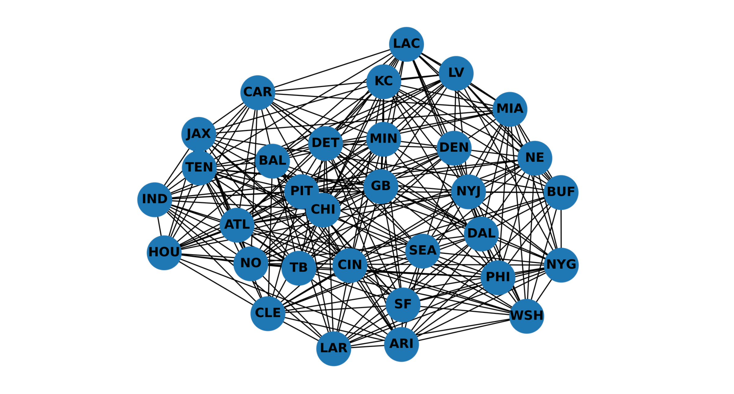
We can represent this numerically by taking the difference of the contrasts we created before, X_diff = X_home - X_away. Each team pairing will be uniquely encoded and the parameter estimate will focus only on the difference of those two teams.
1
2
3
4
5
6
7
8
| # We should have the same teams represented in the home and away teams.
assert (X_home.columns == X_away.columns).all()
# X_diff will represent which two teams played that week.
# Specifically, +1 will represent home and -1 will be away (except reference level).
X_diff = X_home - X_away
# Ensure we have linear independence.
assert not (X_away.sum(axis=1) == 0).all()
render_table(X_diff.head())
|
| | ATL | BAL | BUF | CAR | CHI | CIN | CLE | DAL | DEN | DET | GB | HOU | IND | JAX | KC | LAC | LAR | LV | MIA | MIN | NE | NO | NYG | NYJ | PHI | PIT | SEA | SF | TB | TEN | WSH |
|---|
| 0 | 0 | 0 | -1 | 0 | 0 | 0 | 0 | 0 | 0 | 0 | 0 | 0 | 0 | 0 | 0 | 0 | 0 | 0 | 0 | 0 | 0 | 0 | 0 | 1 | 0 | 0 | 0 | 0 | 0 | 0 | 0 |
| 1 | 0 | 0 | 0 | 0 | 0 | 0 | 0 | 0 | 0 | -1 | 0 | 0 | 0 | 0 | 1 | 0 | 0 | 0 | 0 | 0 | 0 | 0 | 0 | 0 | 0 | 0 | 0 | 0 | 0 | 0 | 0 |
| 2 | 0 | 1 | 0 | 0 | 0 | 0 | 0 | 0 | 0 | 0 | 0 | -1 | 0 | 0 | 0 | 0 | 0 | 0 | 0 | 0 | 0 | 0 | 0 | 0 | 0 | 0 | 0 | 0 | 0 | 0 | 0 |
| 3 | 0 | 0 | 0 | 0 | 0 | -1 | 1 | 0 | 0 | 0 | 0 | 0 | 0 | 0 | 0 | 0 | 0 | 0 | 0 | 0 | 0 | 0 | 0 | 0 | 0 | 0 | 0 | 0 | 0 | 0 | 0 |
| 4 | 0 | 0 | 0 | 0 | 0 | 0 | 0 | 0 | 0 | 0 | 0 | 0 | 0 | 0 | 0 | 0 | 0 | 0 | 0 | 1 | 0 | 0 | 0 | 0 | 0 | 0 | 0 | 0 | -1 | 0 | 0 |
1
2
3
4
5
6
7
8
9
10
11
12
13
14
15
16
17
18
| # We can visualize the "encoding" and see how often one team played another.
def encoding(x: pd.Series) -> str:
# Just concatenate all of the contrasts into one long string encoding.
return "".join(str(i) for i in x)
# We can see how the encoding maps back to the original teams
# and the frequency of this matchup.
df["encoding"] = X_diff.apply(encoding, axis=1)
render_table(
df.groupby("encoding")[["homeTeamAbbr", "awayTeamAbbr"]]
.agg(["unique", "count"])
.sort_values(
[("homeTeamAbbr", "count"), ("awayTeamAbbr", "count")], # type: ignore
ascending=False,
)
.head()
)
|
| encoding | (‘homeTeamAbbr’, ‘unique’) | (‘homeTeamAbbr’, ‘count’) | (‘awayTeamAbbr’, ‘unique’) | (‘awayTeamAbbr’, ‘count’) |
|---|
| 00-10000000000000001000000000000 | [‘MIA’] | 2 | [‘BUF’] | 2 |
| 000-1000000000000000001000000000 | [‘NO’] | 2 | [‘CAR’] | 2 |
| 00000-10000000010000000000000000 | [‘KC’] | 2 | [‘CIN’] | 2 |
| 000000-1000010000000000000000000 | [‘HOU’] | 2 | [‘CLE’] | 2 |
| 00000000000-11000000000000000000 | [‘IND’] | 2 | [‘HOU’] | 2 |
1
2
3
| # Tie goes to the home team, since we want to keep the outcomes binary.
y = pd.Series((df.homeScore >= df.awayScore), name="homeTeamWin").astype(int)
render_table(y.head())
|
We also include an intercept $\alpha$, which is a coefficient for the home team advantage. Our final model is then:
\[\log{\frac{p_{ij}}{1 - p_{ij}}} = \alpha + \beta_i - \beta_j = \alpha + \Delta_{ij}\]
Where $\Delta_{ij}$ is the difference of the contrasts we computed before.
Design Matrix
1
2
3
4
5
6
7
| formula = "homeTeamWin ~ 1 + " + " + ".join(X_diff.columns)
y, X = patsy.dmatrices(
formula,
pd.concat([y, X_diff], axis=1),
return_type="dataframe",
)
Markdown(formula)
|
homeTeamWin ~ 1 + ATL + BAL + BUF + CAR + CHI + CIN + CLE + DAL + DEN + DET + GB + HOU + IND + JAX + KC + LAC + LAR + LV + MIA + MIN + NE + NO + NYG + NYJ + PHI + PIT + SEA + SF + TB + TEN + WSH
VIF
Variance inflation factor measures the amount of collinearity in the dataset. It is recommended to keep this under < 5 when performing statistical inference.
1
2
3
4
5
6
7
8
9
10
11
12
| # Print the VIF to see how much collinearity there are in the features.
# We want to avoid VIF > 5.
render_plotly_html(
px.histogram(
pd.Series(
[variance_inflation_factor(X, i) for i, _ in enumerate(X.columns)],
name="VIF",
),
nbins=15,
title="Distribution of VIF",
)
)
|
Bradley Terry GLM
Now we fit the BT model. Since we are modeling logits of a probability, this reduces to logistic regression. This is widely available, we will use statsmodel’s GLM.
1
2
3
4
5
6
7
8
| # Fit a GLM with Binomial family and logit link function.
results = sm.GLM(
endog=y,
exog=X,
family=sm.families.Binomial(
link=sm.families.links.Logit(),
),
).fit()
|
Generalized Linear Model Regression Results| Dep. Variable: | homeTeamWin | No. Observations: | 332 |
|---|
| Model: | GLM | Df Residuals: | 300 |
|---|
| Model Family: | Binomial | Df Model: | 31 |
|---|
| Link Function: | Logit | Scale: | 1.0000 |
|---|
| Method: | IRLS | Log-Likelihood: | -198.10 |
|---|
| Date: | Sat, 28 Sep 2024 | Deviance: | 396.19 |
|---|
| Time: | 23:13:58 | Pearson chi2: | 332. |
|---|
| No. Iterations: | 4 | Pseudo R-squ. (CS): | 0.1657 |
|---|
| Covariance Type: | nonrobust | | |
|---|
| coef | std err | z | P>|z| | [0.025 | 0.975] |
|---|
| Intercept | 0.2235 | 0.122 | 1.829 | 0.067 | -0.016 | 0.463 |
|---|
| ATL | 0.2448 | 0.724 | 0.338 | 0.735 | -1.174 | 1.664 |
|---|
| BAL | 1.9120 | 0.717 | 2.666 | 0.008 | 0.506 | 3.318 |
|---|
| BUF | 1.5916 | 0.734 | 2.167 | 0.030 | 0.152 | 3.031 |
|---|
| CAR | -0.9843 | 0.855 | -1.152 | 0.249 | -2.659 | 0.691 |
|---|
| CHI | 0.3354 | 0.727 | 0.461 | 0.645 | -1.089 | 1.760 |
|---|
| CIN | 0.8876 | 0.713 | 1.245 | 0.213 | -0.510 | 2.285 |
|---|
| CLE | 1.2966 | 0.708 | 1.832 | 0.067 | -0.091 | 2.684 |
|---|
| DAL | 1.3452 | 0.711 | 1.892 | 0.058 | -0.048 | 2.739 |
|---|
| DEN | 0.7358 | 0.740 | 0.994 | 0.320 | -0.714 | 2.186 |
|---|
| DET | 1.7979 | 0.719 | 2.499 | 0.012 | 0.388 | 3.208 |
|---|
| GB | 1.1053 | 0.718 | 1.540 | 0.124 | -0.302 | 2.513 |
|---|
| HOU | 1.1260 | 0.714 | 1.577 | 0.115 | -0.273 | 2.525 |
|---|
| IND | 0.7037 | 0.733 | 0.960 | 0.337 | -0.733 | 2.141 |
|---|
| JAX | 0.7857 | 0.741 | 1.060 | 0.289 | -0.667 | 2.239 |
|---|
| KC | 2.0205 | 0.749 | 2.698 | 0.007 | 0.553 | 3.488 |
|---|
| LAC | 0.2262 | 0.760 | 0.298 | 0.766 | -1.262 | 1.715 |
|---|
| LAR | 1.2363 | 0.670 | 1.845 | 0.065 | -0.077 | 2.549 |
|---|
| LV | 0.6112 | 0.753 | 0.812 | 0.417 | -0.864 | 2.087 |
|---|
| MIA | 1.1409 | 0.746 | 1.530 | 0.126 | -0.321 | 2.602 |
|---|
| MIN | 0.9293 | 0.730 | 1.272 | 0.203 | -0.502 | 2.361 |
|---|
| NE | -0.2335 | 0.778 | -0.300 | 0.764 | -1.757 | 1.290 |
|---|
| NO | 0.7731 | 0.743 | 1.041 | 0.298 | -0.682 | 2.229 |
|---|
| NYG | 0.2182 | 0.718 | 0.304 | 0.761 | -1.190 | 1.626 |
|---|
| NYJ | 0.5562 | 0.744 | 0.748 | 0.455 | -0.902 | 2.014 |
|---|
| PHI | 1.3884 | 0.714 | 1.944 | 0.052 | -0.012 | 2.788 |
|---|
| PIT | 1.4859 | 0.716 | 2.076 | 0.038 | 0.083 | 2.889 |
|---|
| SEA | 1.3372 | 0.701 | 1.907 | 0.057 | -0.037 | 2.712 |
|---|
| SF | 1.8241 | 0.699 | 2.611 | 0.009 | 0.455 | 3.193 |
|---|
| TB | 1.0179 | 0.729 | 1.396 | 0.163 | -0.411 | 2.447 |
|---|
| TEN | -0.1036 | 0.763 | -0.136 | 0.892 | -1.599 | 1.392 |
|---|
| WSH | -0.0545 | 0.726 | -0.075 | 0.940 | -1.478 | 1.369 |
|---|
1
2
3
| # Verify that the Binomial family with a Logit link is equivalent with the Logit binary model.
logit_params = sm.Logit(endog=y, exog=X).fit().params
pd.testing.assert_series_equal(logit_params, results.params)
|
1
2
3
| Optimization terminated successfully.
Current function value: 0.596675
Iterations 6
|
1
2
3
4
5
6
7
8
| # Compute the confusion matrix on the training predictions.
render_table(
pd.DataFrame(
confusion_matrix(y_pred=results.predict(X) > 0.5, y_true=y),
columns=["Home Loss", "Home Win"],
index=["Home Loss", "Home Win"],
)
)
|
| | Home Loss | Home Win |
|---|
| Home Loss | 89 | 59 |
| Home Win | 43 | 141 |
Analysis of GLM Results
1
2
3
4
5
6
7
8
| results_df = pd.DataFrame(
{
"p-value": results.pvalues,
"parameter": results.params,
"team": results.params.index,
"Parameter Rank": results.params.rank(ascending=False),
}
)
|
P-values
1
2
3
4
5
6
7
8
9
10
11
| # Visualize the parameter estimate vs. p-value.
# As expected, this should roughly trace out a normal distribution.
render_plotly_html(
px.scatter(
results_df,
x="parameter",
y="p-value",
color="team",
title="P-Value vs. Parameter Estimate",
)
)
|
Parameter Ranks
1
2
3
4
5
6
7
8
9
10
11
| # Tally all of the team's wins (if y == 1, then home won, otherwise away won).
team_wins = pd.Series(
np.where(y.squeeze(), df.homeTeamAbbr, df.awayTeamAbbr)
).value_counts()
# Tally games played in total by each team.
team_n = pd.concat([df.homeTeamAbbr, df.awayTeamAbbr]).value_counts()
win_df = pd.DataFrame({"wins": team_wins, "n": team_n})
win_df["win"] = win_df.wins / win_df.n
win_df.sort_values(by="win", ascending=False, inplace=True)
win_df["Win Rank"] = win_df.win.rank(ascending=False)
render_table(win_df.head())
|
| | wins | n | win | Win Rank |
|---|
| KC | 17 | 23 | 0.73913 | 1 |
| DET | 16 | 23 | 0.695652 | 2 |
| BAL | 15 | 22 | 0.681818 | 4 |
| BUF | 15 | 22 | 0.681818 | 4 |
| SF | 15 | 22 | 0.681818 | 4 |
1
2
3
4
5
6
7
8
9
10
11
12
13
14
15
16
17
18
19
20
21
| # Join the parameter results with the raw win percentages.
results_win_df = results_df.merge(win_df, left_index=True, right_index=True)
# Plot the parameter rank vs. the win percentage rank
fig_rank = px.scatter(
results_win_df,
x="Parameter Rank",
y="Win Rank",
color="team",
title="Win Percentage Rank vs. Parameter Estimate Rank",
)
# Add a reference line. If points fall on the line, then parameter_rank == win_rank.
# Otherwise, the Bradley Terry model and raw win percentage disagree.
fig_rank.add_scatter(
x=results_win_df["Parameter Rank"],
y=results_win_df["Parameter Rank"],
mode="lines",
name="Reference",
line=dict(color="red", width=2, dash="dash"),
hoverinfo="skip",
)
render_plotly_html(fig_rank)
|
It seems the BT model is especially useful when there are ties in the standings and in some cases (i.e. LAR) where the parameter rank < win rank (indicating the team may be undervalued).
1
2
| # How often do the rankings agree?
(results_win_df["Parameter Rank"] == results_win_df["Win Rank"]).mean()
|
Probability of team i beating team j
We can compute the probabilities using the equation:
\[p_{ij} = \frac{\exp{\alpha + \beta_i - \beta_j}}{1 + \exp{\alpha + \beta_i - \beta_j}}\]
1
2
3
4
5
6
7
8
9
| # Compute the probability of home team i defeating away team j
log_odds = (
results.params.filter(items=["Intercept"]).sum()
+ results.params.filter(items=ALL_TEAMS).values
- results.params.filter(items=ALL_TEAMS).values.reshape(-1, 1)
)
probability_matrix = pd.DataFrame(np.exp(log_odds) / (1 + np.exp(log_odds)))
probability_matrix.columns = results.params.filter(items=ALL_TEAMS).index
probability_matrix.index = results.params.filter(items=ALL_TEAMS).index
|
1
2
3
4
5
6
7
8
9
| render_plotly_html(
px.imshow(
probability_matrix,
labels={"x": "Home Team", "y": "Away Team"},
title="Probability of a Home Team Winning",
aspect="auto",
color_continuous_scale="RdBu_r",
)
)
|
To interpret, we can look at one column (i.e. KC) and see their chances of beating away teams (red scores are better). Conversely, following a row tells us how likely a team is to win on the road.
Adding in Numeric Features
Since the BT model amounts to fitting a logisitic regression model, we can extend our previous attempt with numeric features.
1
2
3
4
5
6
7
8
9
10
11
12
13
14
15
| # Focus on x_per_y style metrics and turnovers.
numeric_features = [
i + j
for i in [
"thirdDownEff",
"fourthDownEff",
"completionAttempts",
"yardsPerRushAttempt",
"yardsPerPass",
"redZoneAttempts",
"interceptions",
"fumblesLost",
]
for j in ["_home", "_away"]
]
|
1
2
3
| def compute_percentage(x: str, delim: str = "-") -> float:
first, second = x.split(delim)
return float(first) / float(second) if float(second) > 0 else 0
|
1
2
3
4
5
6
7
8
9
10
11
12
13
14
15
16
17
18
19
20
21
| # Construct a numeric features dataframe.
X_numeric = df[numeric_features].copy()
X_numeric["redZoneAttempts_home"] = X_numeric.redZoneAttempts_home.map(
compute_percentage
)
X_numeric["thirdDownEff_home"] = X_numeric.thirdDownEff_home.map(compute_percentage)
X_numeric["redZoneAttempts_away"] = X_numeric.redZoneAttempts_away.map(
compute_percentage
)
X_numeric["fourthDownEff_home"] = X_numeric.fourthDownEff_home.map(compute_percentage)
X_numeric["completionAttempts_away"] = X_numeric.completionAttempts_away.map(
lambda x: compute_percentage(x, "/")
)
X_numeric["fourthDownEff_away"] = X_numeric.fourthDownEff_away.map(compute_percentage)
X_numeric["thirdDownEff_away"] = X_numeric.thirdDownEff_away.map(compute_percentage)
X_numeric["completionAttempts_home"] = X_numeric.completionAttempts_home.map(
lambda x: compute_percentage(x, "/")
)
# After these conversions, we should only have numeric features
assert (X_numeric.dtypes != np.object_).all()
render_table(X_numeric.head())
|
| | thirdDownEff_home | thirdDownEff_away | fourthDownEff_home | fourthDownEff_away | completionAttempts_home | completionAttempts_away | yardsPerRushAttempt_home | yardsPerRushAttempt_away | yardsPerPass_home | yardsPerPass_away | redZoneAttempts_home | redZoneAttempts_away | interceptions_home | interceptions_away | fumblesLost_home | fumblesLost_away |
|---|
| 0 | 0.384615 | 0.384615 | 1 | 0 | 0.636364 | 0.707317 | 6.1 | 4.4 | 4.7 | 4.7 | 0.333333 | 0.5 | 1 | 3 | 0 | 1 |
| 1 | 0.357143 | 0.333333 | 0 | 0.333333 | 0.538462 | 0.628571 | 3.9 | 3.5 | 5.8 | 6.9 | 0.666667 | 0.666667 | 1 | 0 | 0 | 1 |
| 2 | 0.533333 | 0.388889 | 0 | 0.25 | 0.772727 | 0.636364 | 3.4 | 3.1 | 6 | 4 | 0.6 | 0 | 1 | 0 | 1 | 1 |
| 3 | 0.285714 | 0.133333 | 0 | 0 | 0.551724 | 0.4375 | 5.2 | 3.8 | 4.5 | 2 | 0.666667 | 0 | 1 | 0 | 1 | 0 |
| 4 | 0.428571 | 0.352941 | 0 | 1 | 0.75 | 0.617647 | 2.4 | 2.2 | 7.1 | 4.8 | 0.333333 | 0.5 | 1 | 0 | 2 | 0 |
Design Matrix
We expand the design matrix from before with the numeric features.
1
2
3
4
5
6
7
8
| formula_full = formula
formula_full += " + " + " + ".join(X_numeric.columns)
y, X_full = patsy.dmatrices(
formula_full,
pd.concat([y, X_diff, X_numeric], axis=1),
return_type="dataframe",
)
Markdown(formula_full)
|
homeTeamWin ~ 1 + ATL + BAL + BUF + CAR + CHI + CIN + CLE + DAL + DEN + DET + GB + HOU + IND + JAX + KC + LAC + LAR + LV + MIA + MIN + NE + NO + NYG + NYJ + PHI + PIT + SEA + SF + TB + TEN + WSH + thirdDownEff_home + thirdDownEff_away + fourthDownEff_home + fourthDownEff_away + completionAttempts_home + completionAttempts_away + yardsPerRushAttempt_home + yardsPerRushAttempt_away + yardsPerPass_home + yardsPerPass_away + redZoneAttempts_home + redZoneAttempts_away + interceptions_home + interceptions_away + fumblesLost_home + fumblesLost_away
Full Bradley Terry GLM
1
2
3
4
5
6
7
8
9
10
| # Fit a GLM with Binomial family and logit link function.
model = sm.GLM(
endog=y,
exog=X_full,
family=sm.families.Binomial(
link=sm.families.links.Logit(),
),
)
results_full = model.fit()
y_hat = results_full.predict(X_full)
|
1
2
3
4
5
6
7
8
9
10
11
12
13
14
15
16
| fpr, tpr, _ = roc_curve(y, y_hat)
fig_roc = px.line(
pd.DataFrame({"True Positive Rate": tpr, "False Positive Rate": fpr}),
x="False Positive Rate",
y="True Positive Rate",
title=f"Probability of Home Team Winning ROC Curve, AUC: {round(roc_auc_score(y, y_hat), 4)}",
)
fig_roc.add_scatter(
x=fpr,
y=fpr,
mode="lines",
name="Reference",
line=dict(color="red", width=2, dash="dash"),
hoverinfo="skip",
)
render_plotly_html(fig_roc)
|
1
2
3
4
5
6
7
| render_table(
pd.DataFrame(
confusion_matrix(y_pred=y_hat > 0.5, y_true=y),
columns=["Home Loss", "Home Win"],
index=["Home Loss", "Home Win"],
)
)
|
| | Home Loss | Home Win |
|---|
| Home Loss | 137 | 11 |
| Home Win | 10 | 174 |
We see a large improvement in the confusion matrix and ROC AUC from adding the numerical features.
Summary
The Bradley Terry model is a classic way to rank preferences applicable in spots statistics. More recently, it has been used in LLM training (check out the Direct Preference Optimization paper for one example) to learn human preferences.